Introduction
Metabolomics is one of the many “omics” scientific fields that have sprung up over the past years and can be broadly summarized as the study of the chemical composition of cells, tissues, and biofluids. “Chemical composition” might sound sinister, but in reality, our cells (and the cells of all living things) are a soup of small compounds such as sugars, amino acids, and many other molecules that are necessary for life. The relative levels of all of these compounds can give a readout of the health of the organism, and scientists are more and more coming to appreciate the role of small molecules in common diseases such as cancer, heart disease, and diabetes.
This project represents one of my typical liquid chromatography-mass spectrometry (LC/MS) metabolomics analysis workflows, which involves the following:
- Exploratory data analysis - evaluating distributions, missing values, principal component analysis, visualization
- Surrogate variable analysis using the
svapackage, in order to detect and account for unexpected batch effects that appear as a result of sample preparation or other technical issues - Linear regression on a categorical variable and on surrogate variables identified by the
svapackage, followed by statistical significance analysis, all using thelimmapackage - Visualization of data cleaned of surrogate variables (residuals)
- Some pathway analysis and interpretation of significant features
The Setup section outlines the importing of packages, data, and the functions that will be used throughout this analysis. This section can be skipped using the table of contents above and referred to as needed.
I don’t want to get too bogged down in the technical details of the experiment, but the most important details are:
- Samples come from tissue culture cells, either treated or not treated with a particular drug. The sample source determines how I will handle missing values.
- Raw instrument data has to be processed/extracted to make it amenable to analysis. There are a variety of approaches to this, including the open source
xcmsBioconductor package, but the data analyzed here was extracted using the proprietary Agilent Profinder software and an in-house database to tentatively identify the compounds. The identifications with be used towards the end in order to draw some conclusions about the impact of the drug on cellular metabolism.
- Another thing that will pop up throughout, is the idea of the two “positive” and “negative” mode datasets. This has to do with instrument settings and how it detects molecules. Mass spectrometers can only detect and measure charged molecules, but molecules can have either positive or negative charges. Negative mode simply means that the instrument only detects and measures negatively charged molecules, while positive mode is for positively-charged molecules. Some molecules can be measured in either mode, and the data from positive and negative mode can be used as corroborative evidence. But some molecules can only be detected in one mode or the other, which is why both datasets are needed. The methodology can vary from lab to lab, but my lab usually runs each sample at least twice, once for each instrument mode, which results in two separate datasets.
The overall goal of the following analysis is to determine which of the compounds detected and quantified were changed in abundance after drug treatment.
Setup
Packages
library(tidyverse)
library(cowplot)
library(heatmaply)
library(sva)
library(limma)
library(broom)
library(ggridges)
Reasons for use:
- tidyverse - data wrangling, plotting, other general functions
- cowplot - ggplot formatting that I like
- heatmaply - interactive heatmaps, a popular visualization format for high-dimensional omics data
- sva - surrogate variable analysis for batch effects
- limma - statistical analysis package, designed and typically used for genomics analyses (microarray studies, RNA-seq), but once the raw samples are processed, the methodologies between the two fields are similar in terms of statistical significance testing
- broom - for
lmmodel tidying - ggridges - useful for creating ridge plots to look at data distributions
Data
There are two data files associated with this analysis:
- Abundance readings from the cells in negative MS mode
- Abundance readings from the cells in positive MS mode
Note: The abundance data collected for this experiment is “semi-quantitative”, in that the abundance values highly depend on instrument state and mode. Samples within a run, such as when the samples were analyzed in negative mode, are comparable to each other. However, these readings are not directly comparable to samples analyzed at another date or time, or to the data collected in positive mode. Even abundance values for the same compound, in the same sample, are likely to not be equal between the two modes, and so the two datasets are analyzed separately. The fold change between experimental groups, however, is expected to be similar for the same compound in both datasets.
# compound abundances #
neg.raw <- read_csv("./data/cells_target_negmode.csv")
pos.raw <- read_csv("./data/cells_target_posmode.csv")
Functions
Personal functions used throughout the analysis. I like to group them into one chunk at the start for organization and to make them easy to find.
MissingPerSamplePlot <- function(raw.data, start.string) {
  # Counts the number of missing/NA values per sample and
  # percent compounds missing out of total number of compounds per sample
  # Then passes the result into a vertical bar plot, where each
  # bar represents a single sample and the size of the bar
  # is the % of compounds missing

  counted.na <- raw.data %>%
  select(starts_with(start.string)) %>%
  mutate(
    count.na = apply(., 1, function(x) sum(is.na(x))),
    percent.na = (count.na / ncol(raw.data %>% select(starts_with(start.string)))) * 100
    ) %>%
  dplyr::select(count.na, percent.na) %>%
  bind_cols(
    raw.data %>%
      select(Samples, Group)
      ) %>%
  arrange(percent.na) %>%
  mutate(f.order = factor(Samples, levels = Samples))
counted.na %>%
  ggplot(aes(x = f.order, y = percent.na, fill = Group)) +
  geom_bar(stat = "identity") +
  geom_hline(yintercept = 20, color = "gray", size = 1, alpha = 0.8) +
  coord_flip()+
  xlab("Samples") +
  ylab("Percent missing values in sample") +
  theme(axis.text.y = element_text(size = 6))
}

MissingPerCompound <- function(raw.data, start.string){
  # Function to count in how many experimental samples each compound is missing
  # Also calculates the % missing:
  # (# NA per compound across all experimental samples) * 100 / (tot num of samples)

  raw.data %>%
  filter(Group == "sample") %>%
  select(Samples, starts_with(start.string)) %>%
  gather(key = "Compound", value = "Abundance", -Samples) %>%
  group_by(Compound) %>%
  summarise(
    na_count = sum(is.na(Abundance)),
    n_samples = n(),
    percent_na = (na_count * 100 / n_samples)
    ) %>%
  filter(na_count > 0) %>%
  arrange(desc(percent_na))
}

ReplaceNAwMinLogTransform <- function(raw.dataframe, start.prefix) {
  # Function to replace any NAs in each column with the minimum for that column,
  # separately for each sample type.
  # NA in negative control samples are replaced by 2.
  # Then data is log2 transformed

  smpls <- raw.dataframe %>%
    filter(Group == "sample") %>%
    dplyr::select(starts_with(start.prefix))
  smpls.min <- lapply(smpls, min, na.rm = TRUE)
  # replace the missing values in the real samples with the minimum of the samples
  # then take the log
  smpls.noNA <- raw.dataframe  %>%
    filter(Group == "sample") %>%
    dplyr::select(Samples:Experiment) %>%
    bind_cols(
      smpls %>%
        replace_na(replace = smpls.min) %>%
        log2()
      )
  # replace the missing values in solv and empty samples with 2 - for PCA analysis
  # then take the log
  other.min <- setNames(
    as.list(
      rep(2, ncol(
        raw.dataframe %>%
          dplyr::select(starts_with(start.prefix))))
      ),
    colnames(raw.dataframe %>% dplyr::select(starts_with(start.prefix)))
                )
  other.num.log <- raw.dataframe %>%
    filter(Group == "solv" | Group == "empty") %>%
    dplyr::select(Samples:Experiment) %>%
    bind_cols(
      raw.dataframe %>%
        filter(Group == "solv" | Group == "empty") %>%
        dplyr::select(starts_with(start.prefix)) %>%
        replace_na(replace = other.min) %>%
        log2()
      )
  # combine them together back into one data frame
  all.noNA <- smpls.noNA %>%
    bind_rows(other.num.log)
}

HeatmapPrepAlt <- function(raw.data, start.prefix){
  # function for preparing dara for heatmap viz
  x <- raw.data %>%
    select(starts_with(start.prefix)) %>%
    scale(center = TRUE, scale = TRUE) %>%
    as.matrix()
  row.names(x) <- raw.data$Samples
  return(x)
}
Data Exploration
Missing Values
The number of missing values that are acceptable per sample and/or per feature can vary depending on the sample source, compound identity, and instrumentation state. I mentioned earlier that the biological origin of these datasets is tissue culture cells. This tends to be a material-rich source and a high missing-value count could indicate a problem with the sample preparation or an instrument error, both of which would be reasonable cause to exclude samples or features from further analysis. The threshold of >= 20% missing seems reasonable to me, which is what I use here.
Q: Do any of the samples have greater than 20% missing (NA) compound abundances, out of all of the features in the dataset?
MissingPerSamplePlot(neg.raw, "ANPnC") +
  ggtitle("Missing Per Sample\nPost Drug Treatment\nNeg Mode")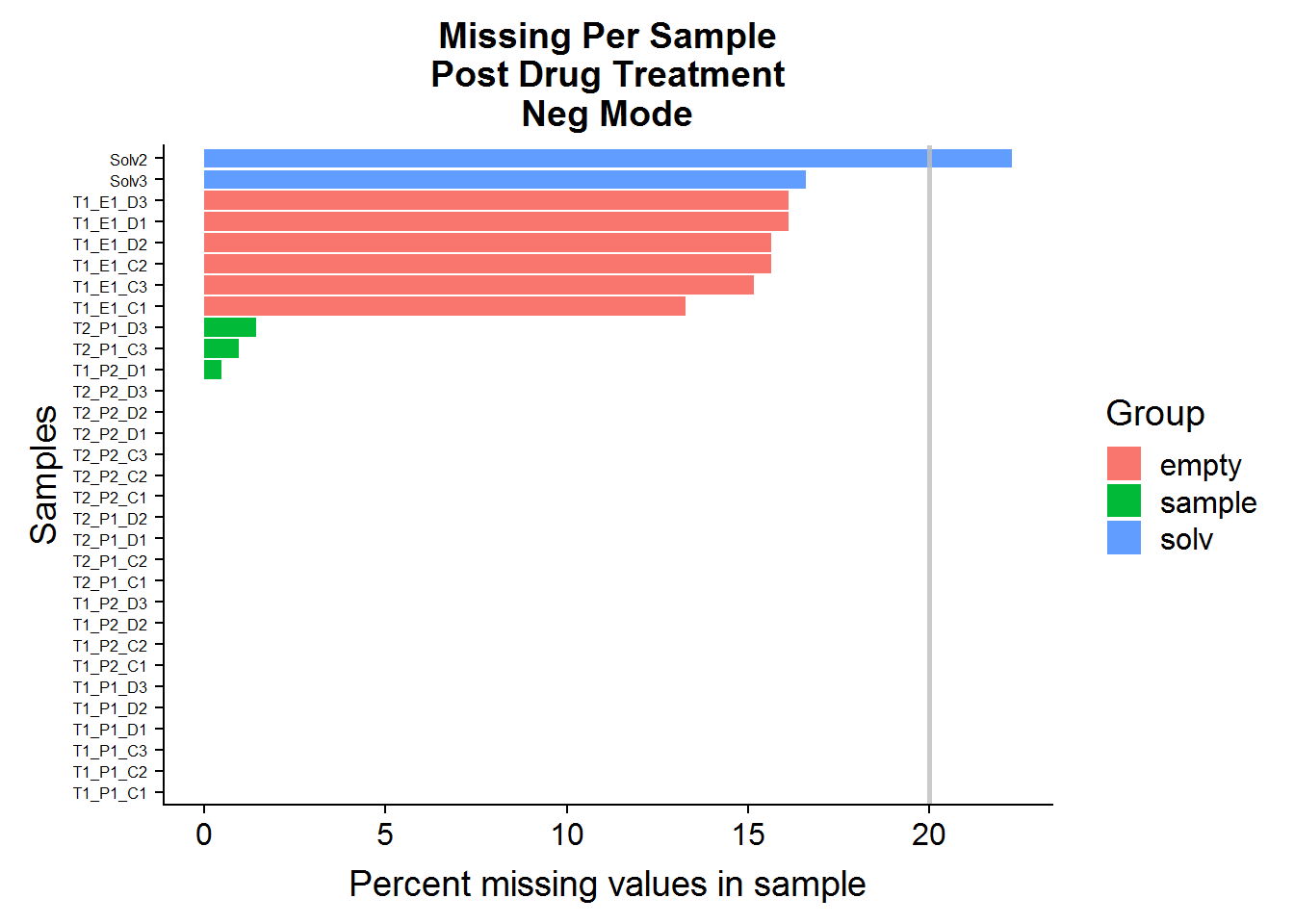
MissingPerSamplePlot(pos.raw, "ANPpC") +
  ggtitle("Missing Per Sample\nPost Drug Treatment\nPos Mode")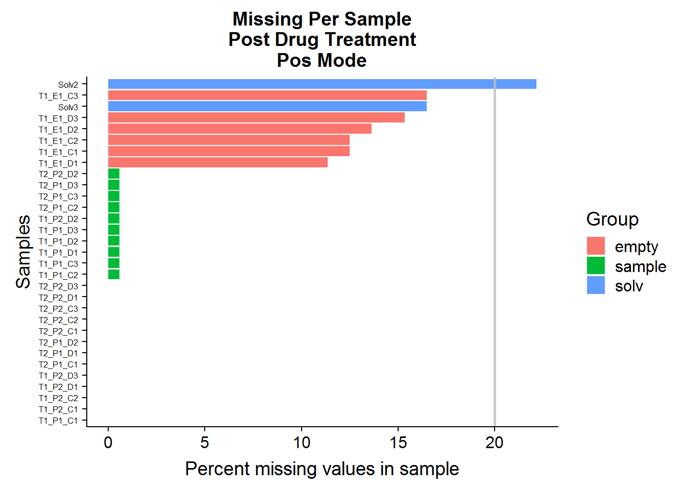
A: No, sample files across both datasets have very few missing values. The green-colored bars, marked “sample” are the actual experimental samples. Whereas the “solv”, or “solvent”, and “empty” samples are negative control samples that are expected to have many missing values and/or low compound abundances. They will be used to narrow down the list of features later on in the analysis.
Q: Are any of the compounds more than 20% missing in the experimental sample group? If there are any, they will be excluded from analysis.
Note: The MissingPerCompound function considers only the Group == "sample" samples.
MissingPerCompound(neg.raw, "ANPnC") %>%
  filter(percent_na > 20)
# A tibble: 0 x 4
# ... with 4 variables: Compound <chr>, na_count <int>, n_samples <int>,
# percent_na <dbl>(pos.cmpnd.to.excl <- MissingPerCompound(pos.raw, "ANPpC") %>%
filter(percent_na > 20))# A tibble: 1 x 4
Compound na_count n_samples percent_na
<chr> <int> <int> <dbl>
1 ANPpC110 9 23 39.1A: No compounds need to be excluded from the negative mode dataset, but 1 compound will be excluded from the positive mode dataset.
Negative Controls and Compound Elimination
Background
The term negative control should not be confused with the negative/positive terminology used throughout to refer to the datasets.
Good experimental design often involves including certain types of samples known as negative and positive controls. Positive controls are samples where you know for sure that whatever you’re measuring is present, and are a verification that the instrument can detect and measure your target as expected. Negative controls, on the other hand, are used to make sure that the signal of interest is real and not an artifact of the detection or sample preparation method.
In the case of this analysis, there are no positive controls, but there are two sets of negative controls:
solv: These are “solvent” samples - samples of just the chemical solvent that the biological samples are dissolved in for instrument analysis. Any compounds detected in these samples are probably artifacts from experimental tools themselves, such as the sample vials or plastic pipettes.empty: This group of samples is derived by treating tissue culture wells the same as the experimental cell samples, but these had no actual cells grown in them. These samples are a control for the preparation process. Cells are typically grown in very nutrient-rich liquid broth/media that is hard to get rid of completely. If any compound is present in high abundance in these “empty” samples, it may be a sigh of technical variation that can obscure biological variation.
Note: Metabolomics measurements tend to have a right-skew, with many lower values and a few very high values that tend to stretch the distribution out. The data is often log transformed to normalize it, and throughout this analysis, I use log2 transformation because that is the format expected by the limma package.
Negative Mode
# get the mean abundance of each compound, grouped by solvent vs empty sample vs experimental sample
neg.raw.grp.mean <- neg.raw %>%
  group_by(Group) %>%
  summarize_at(vars(matches("ANPnC")), mean, na.rm = TRUE) %>%
  gather(key = "Compound", value = "Grp_mean_abun", -Group)
# plot the log2 density distribution of the means
neg.raw.grp.mean %>%
  ggplot(aes(log2(Grp_mean_abun), color = Group)) +
  geom_density(size = 2, alpha = 0.8) +
ggtitle("Distribution of compound means\nNegative Mode\nGrouped by sample type")![]()
The distributions of the means are fairly close to normal and, in general, the compound means for the two negative control groups are lower than the experimental group means, although there is some overlap.
A profile plot of the group means for each compound is a helpful tool to visualize the data:
# for plotting purposes, to make the plot neater
neg.raw.grp.mean.order <- neg.raw.grp.mean %>%
  filter(Group == "sample") %>%
  arrange(Grp_mean_abun)
neg.raw %>%
  select(Samples, Group, starts_with("ANPnC")) %>%
  gather("Compound", value = "Abundance", -c(Samples, Group)) %>%
  mutate(Cmpnd_sort = factor(Compound, levels = neg.raw.grp.mean.order$Compound)) %>%
  ggplot(aes(Cmpnd_sort, log2(Abundance), color = Group, group = Samples)) +
  geom_line(alpha = 0.1, size = 1) +
  theme(axis.text.x = element_blank(), axis.ticks.x = element_blank()) +
  xlab("Compound") +
  # overlay the group averages
  geom_line(
    data = neg.raw.grp.mean %>%
      mutate(Cmpnd_sort = factor(Compound, levels = neg.raw.grp.mean.order$Compound)),
    aes(Cmpnd_sort, log2(Grp_mean_abun), color = Group, group = Group),
    size = 0.5
    ) +
ggtitle("Profile Plot of all compound abundances\nWith average per sample type overlaid\nNegative Mode")![]()
# compound mean by group only, ordered by increasing abundance in the experimental samples
neg.raw.grp.mean %>%
  mutate(Cmpnd_sort = factor(Compound, levels = neg.raw.grp.mean.order$Compound)) %>%
  ggplot(aes(Cmpnd_sort, log2(Grp_mean_abun), color = Group, group = Group)) +
  geom_point(size = 1, alpha = 0.8) +
  geom_line(alpha = 0.8) +
  theme(axis.text.x = element_blank(), axis.ticks.x = element_blank()) +
  xlab("Compound") +
  ylab("log2(Sample Type Mean)") +
ggtitle("Profile Plot of compound means by sample type only\nNegative Mode")![]()
The compound means of the experimental samples are compared above to both types of negative controls. Hopefully, it is possible to see in the plots that, for some compounds, the abundance in the “empty” samples exceeds the experimental samples. This is an indication that there was a high amount of carryover of that compound from the media and that these compounds should be excluded from the analysis.
Note that the experimental sample mean was taken across treatments (drug-treated and not treated) in an attempt to reduce bias at this stage by cherry picking features inappropriately.
It might also be useful to compare the two negative control groups to each other by normalizing to the experimenal group:
neg.raw.grp.diff <- neg.raw.grp.mean %>%
  spread(Group, Grp_mean_abun) %>%
  mutate(
    smpl_empty_diff = sample / empty,
    smpl_solv_diff = sample / solv
    )
# plot the two negative controls against each other:
neg.raw.grp.diff %>%
  ggplot(aes(log2(smpl_empty_diff), log2(smpl_solv_diff))) +
  geom_point(size = 2, alpha = 0.5) +
  xlim(-3, 13.5) +
  ylim(-3, 13.5) +
  # abline in pink
  geom_abline(intercept = 0, slope = 1, color =  "#CC79A7", size = 2, alpha = 0.6) +
  # lm line in green
  geom_smooth(method = "lm", color = "#009E73", size = 2, alpha = 0.6, se = FALSE) +
  xlab("log2([Sample Compound Mean] / [Empty Compound Mean])") +
  ylab("log2([Sample Compound Mean] / [Solvent Compound Mean])") +
ggtitle("Background signal\nRaw Data / Cells / Neg Mode")![]()
# include compounds with FC > 2.5 or FC is NA (indication of NA in solv or empty)
neg.cmpnd.to.incl <- neg.raw.grp.diff %>%
  filter((smpl_solv_diff > 2.5 & smpl_empty_diff > 2.5) | is.na(smpl_solv_diff) | is.na(smpl_empty_diff))
# how many compound were there in the raw negative mode dataset?
nrow(neg.raw.grp.diff)
[1] 211# how many compounds are retained for further analysis?
nrow(neg.cmpnd.to.incl)[1] 179Interestingly, there seems to be a linear relationship between the two types of negative controls, although the signal to noise ratio tends to be higher in the solvent comparison versus the empty sample comparison.
The cut-off of 2.5 is arbitrary. It’s twice the fold-change cut-off that I will use as a threshold later for the treatment comparison, and I plan to repeat this experiment to test if the results are reproducible, so this feels like a comfortable threshold. In the end, 179 out of the 211 features from this set will be included in the final analysis.
Positive Mode
The same procedure as above can be applied to the positive mode data, but I’m only going to show the results because the code is redundant.
![]()
![]()
![]()
# how many compound were there in the raw negative mode dataset?
nrow(pos.raw.grp.diff)
[1] 176# how many compounds are retained for further analysis?
nrow(pos.cmpnd.to.incl)[1] 142The positive mode data is very similar to the negative mode data, and about the same portion of metabolites is retained after filtering based on background noise.
Data Prep and Preliminary Analysis
Cleanup
Both datasets will be prepared for downstream analysis in the following way:
- Exclude compounds that have a >20% NA across samples
- Exclude compounds that have a low signal-to-noise ratio in comparison to the negative controls (previous section)
- The missing values (NA) in the experimental samples will be replaced with the minimum for that group and by 2 for the solvent and empty samples, and then the values will be log2() transformed
neg.noNA <- neg.raw %>%
  select(Samples:Experiment, one_of(neg.cmpnd.to.incl$Compound)) %>%
  ReplaceNAwMinLogTransform("ANPnC")
pos.noNA <- pos.raw %>%
  select(Samples:Experiment, one_of(pos.cmpnd.to.incl$Compound)) %>%
  ReplaceNAwMinLogTransform("ANPpC")
Distribution Plots
The following section isn’t the most exciting, but these plots can be helpful in detecting any problem samples after the cleanup step.
Negative Mode
# convert the wide format to long for plotting
neg.noNA.gathered <- neg.noNA %>%
gather(
key = "Metabolite", "Abundance",
which(colnames(neg.noNA) == "ANPnC1"):ncol(neg.noNA)
)
# plot all abundances in a sample, grouped by sample as a boxplot
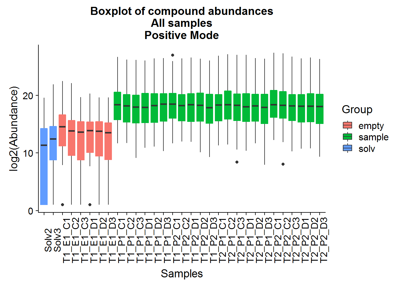
neg.noNA.gathered %>%
ggplot(aes(Samples, Abundance, fill = Group)) +
geom_boxplot() +
geom_boxplot(aes(color = Group), fatten = NULL, fill = NA, coef = 0, outlier.alpha = 0, show.legend = FALSE) +
theme(axis.text.x = element_text(angle = 90)) +
ylab("log2(Abundance)") +
ggtitle("Boxplot of compound abundances\nAll samples\nNegative Mode")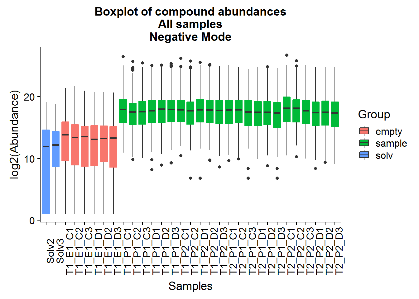
# same data format, but as ridge plots
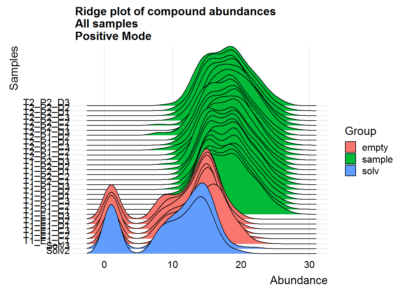
neg.noNA.gathered %>%
ggplot(aes(y = Samples, x = Abundance, fill = Group)) +
geom_density_ridges(scale = 15) +
theme_ridges() +
scale_y_discrete(expand = c(0.01, 0)) +
ggtitle("Ridge plot of compound abundances\nAll samples\nNegative Mode")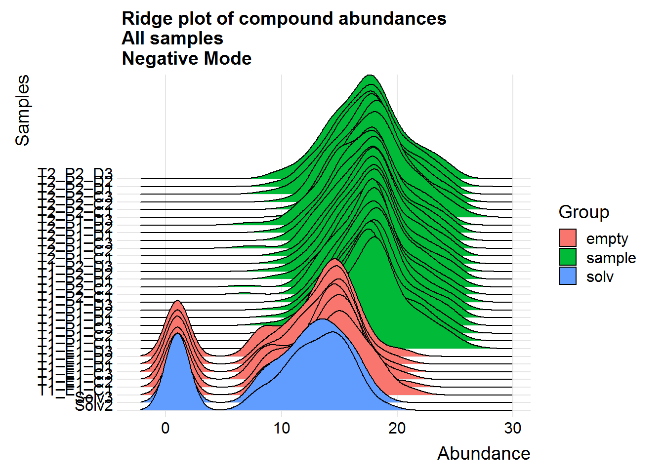
# experimental samples only
neg.noNA.gathered %>%
  filter(Group == "sample") %>%
  ggplot(aes(y = Samples, x = Abundance, fill = Treatment)) +
  geom_density_ridges(scale = 10) +
  theme_ridges() +
  scale_y_discrete(expand = c(0.01, 0)) +
  ggtitle("Ridge plot of compound abundances\nExperimental samples only\nNegative Mode")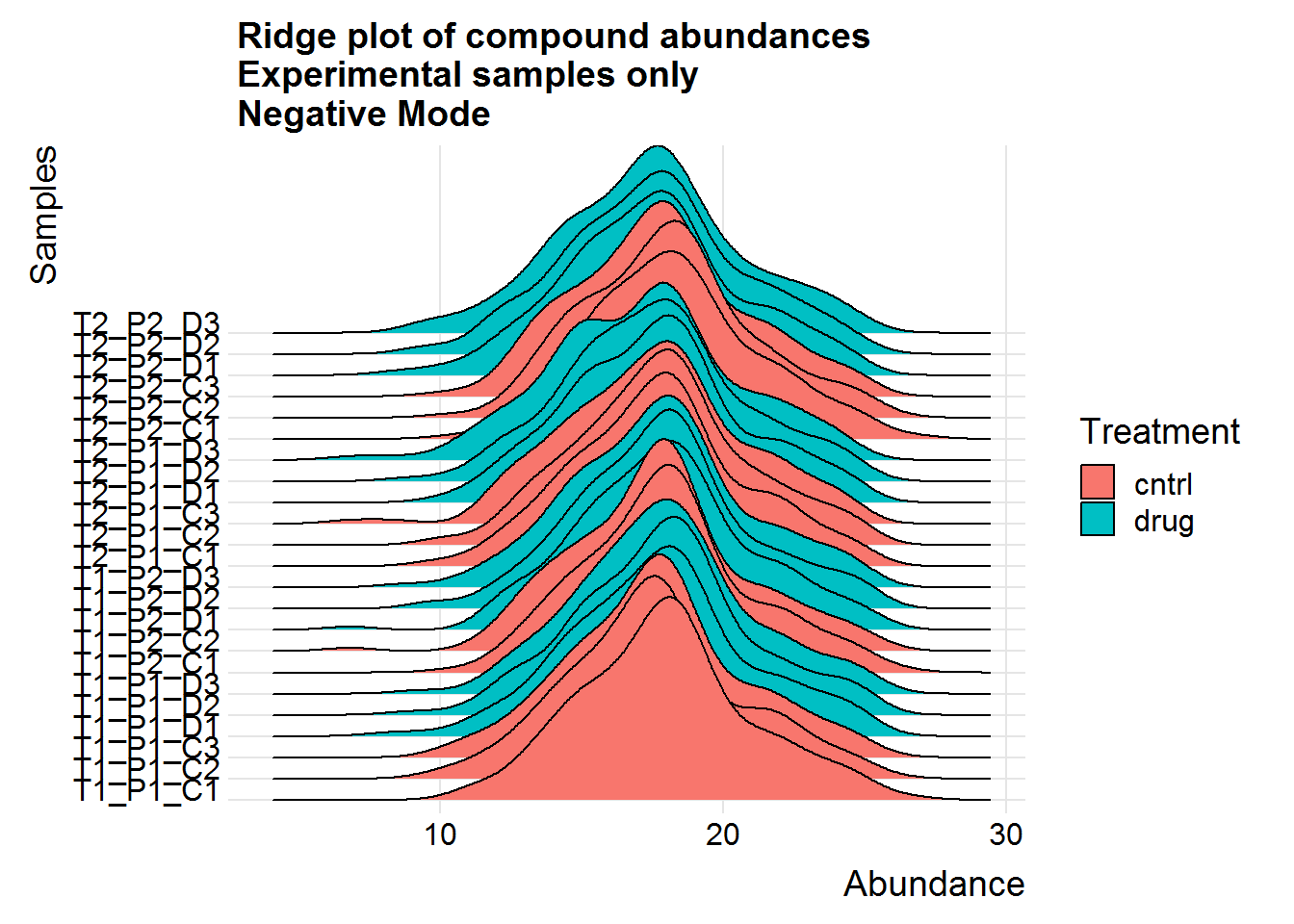
# overlay the distributions for another look
neg.noNA.gathered %>%
  filter(Group == "sample") %>%
  ggplot(aes(Abundance, group = Samples, color = Treatment)) +
  geom_density(alpha = 0.8, size = 0.75) +
  xlab("log2(Abundance)") +
  ggtitle("Density plot of compound abundances\nExperimental samples only\nNegative Mode")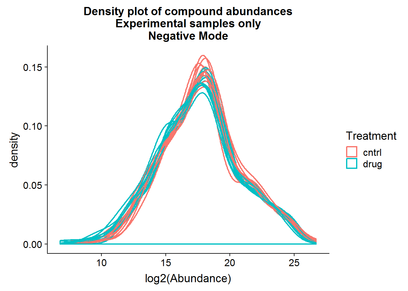
Above are a couple of different ways of visualizing the data distributions. Overall, although the log-transformed data is not perfectly normal, there does not appear to be any serious issues.
Positive Mode
Repeat the above for the second dataset. The code is basically the same as the section above, so I will only include the plots.
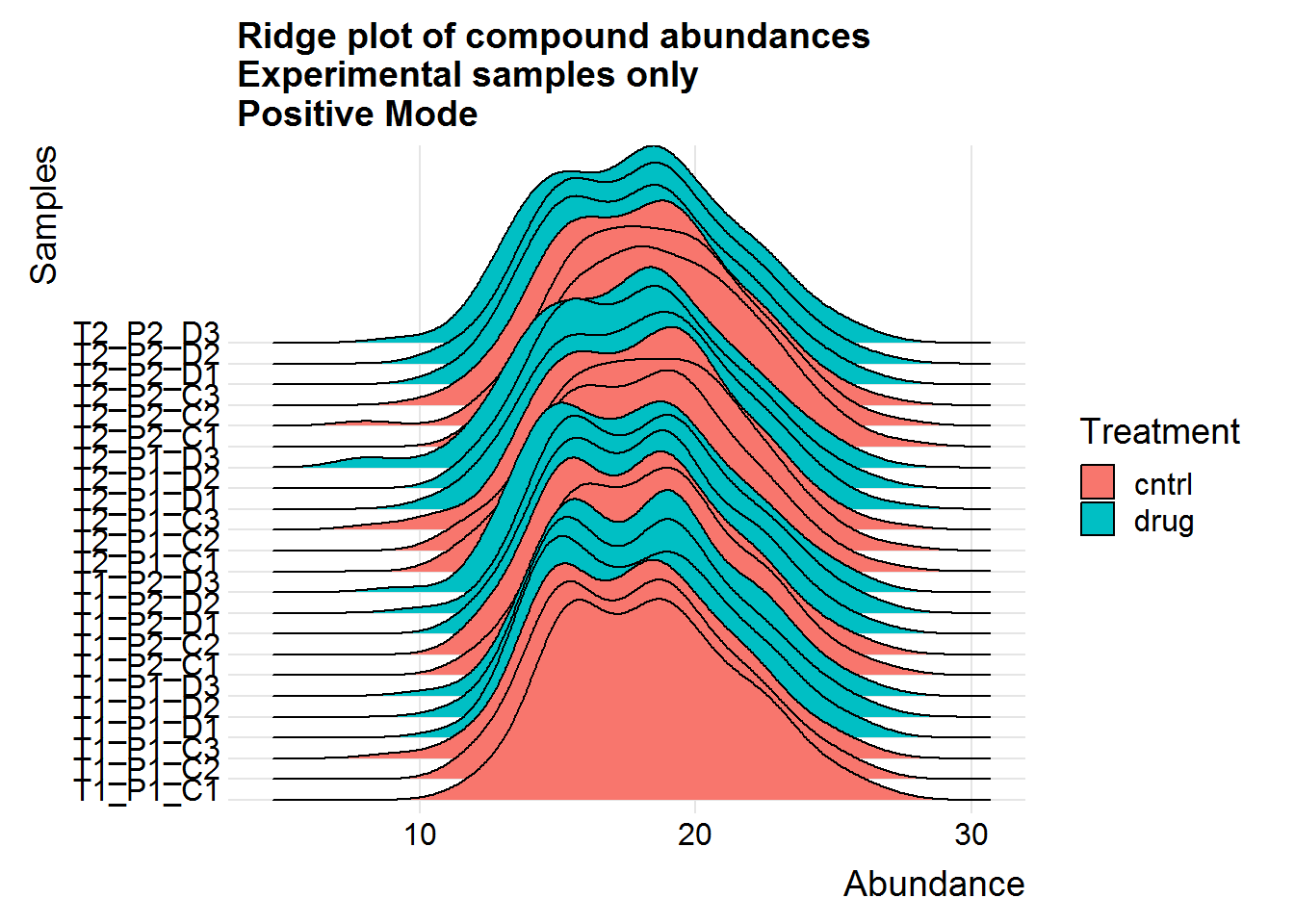
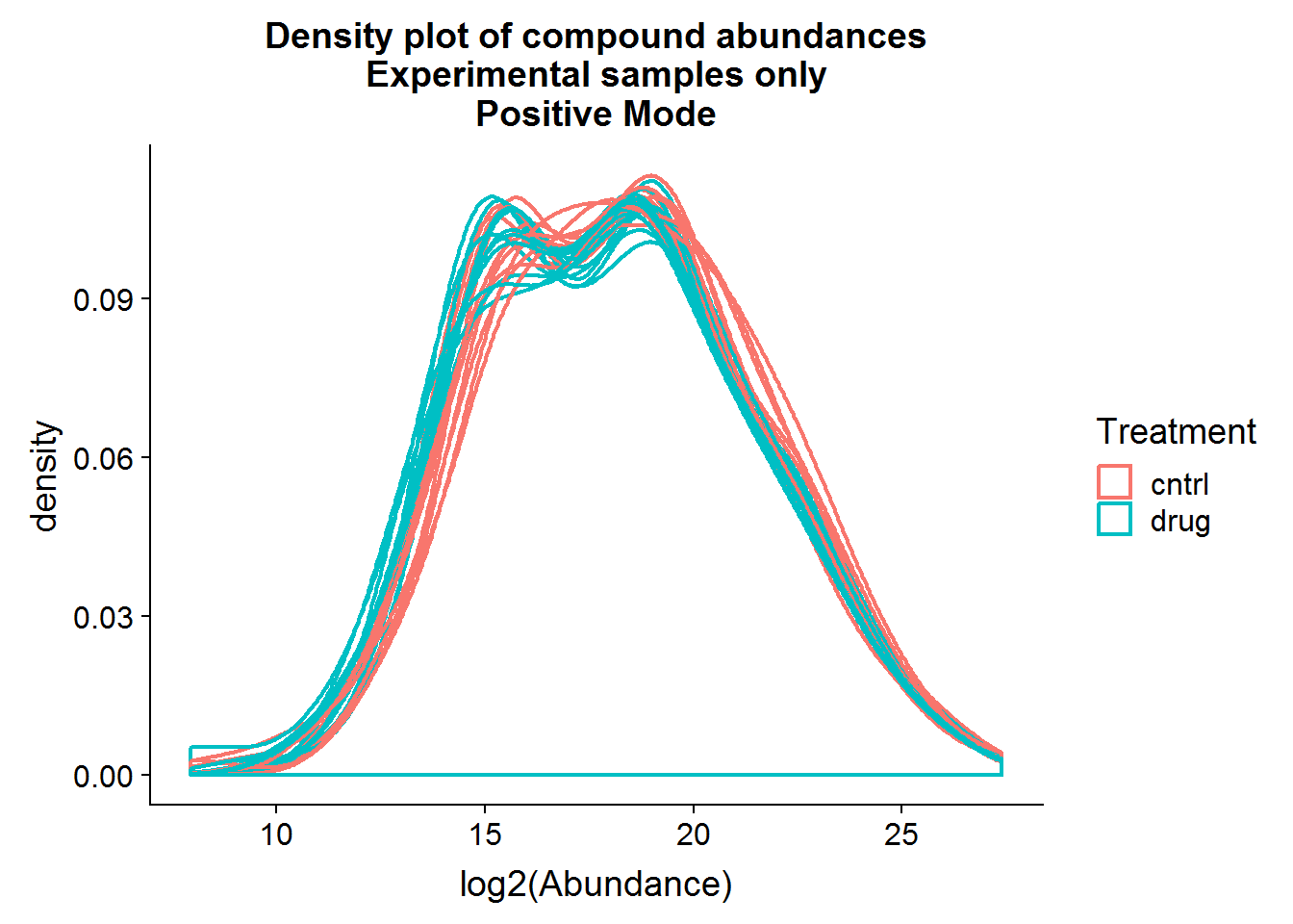
The positive mode experimental samples look more bimodal, in terms of distribution shape. There was a hint of this in the density plot of compound means in the previous section, before missing value replacement. I’m not sure what might be the reason behind this.
Principal Component Analysis
Background
Principal component analysis (PCA) is used commonly in “omics” experiments as a dimension reduction technique to visualize relationships in high dimensional data. There are far more detailed explanations of this machine learning technique available elsewhere, but in brief, it extracts the shared variance between compounds across samples and combines the information into a far smaller number of new variables, or principal components. Often, compounds, genes, or other features will tend to correlate with each other, and the relationship can be simplified through PCA with some loss of information, but at the advantage of ease of visualization and a better understanding of the underlying data structure. In some cases, PCA can be used to discover unexpected or unwanted structure in the data, which can be introduced as covariates in the downstream analysis.
Negative Mode
# PCA on all Samples #
neg.full.pca <- neg.noNA %>%
  select(starts_with("ANPnC")) %>%
  # good idea to center data before pca, but scaling should not be necessary
  mutate_all(scale, center = TRUE, scale = FALSE) %>%
  as.matrix() %>%
  prcomp()
# plot variance explained by each new principal component
plot(
  (neg.full.pca$sdev ^ 2) * 100 / sum(neg.full.pca$sdev ^ 2),
  xlab = "Principal Component",
  ylab = "Variance Explained",
  main = "Percent variance explained by each principal component\nAll samples only\nNegative Mode",
  type = "b"
  )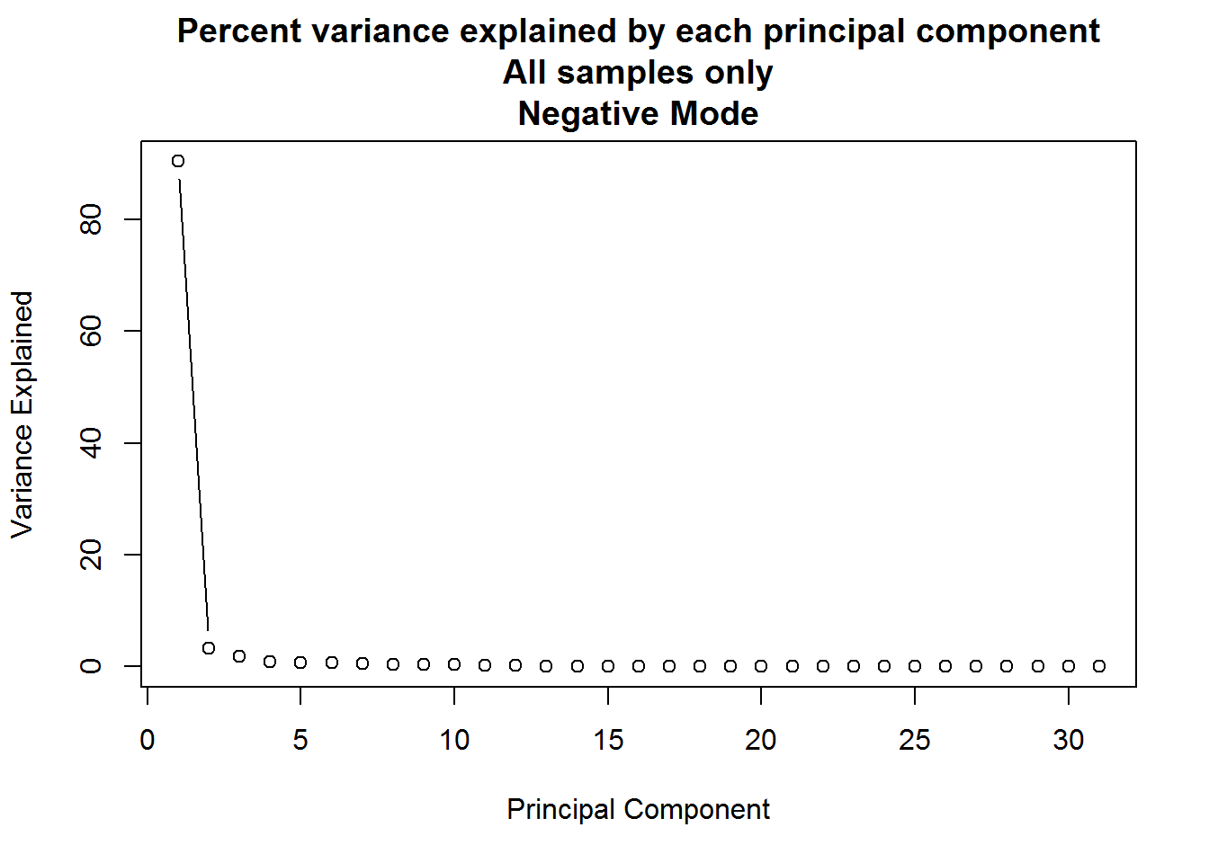
PCA analysis can result in a large number of components, but typically only the first few provide useful information. A plot such as the one above can be used to determine how many to keep by looking for an “elbow” in the plot of variance explained vs principal component.
Q: For the principal component analysis on the full dataset, the first principal component accounts for approximately 90% of the variance in the data, but is this meaningful?
neg.full.pca.x <- as.data.frame(neg.full.pca$x)
row.names(neg.full.pca.x) <- neg.noNA$Samples
neg.full.pca.x <- neg.full.pca.x %>%
  bind_cols(neg.noNA %>% select(Group:Experiment))
neg.full.pca.x %>%
  ggplot(aes(x = PC1, y = PC2, color = Group)) +
  geom_point(size = 4, alpha = 0.8) +
  xlab("PC1 (90.4% Var)") +
  ylab("PC2 (3.3%)") +
  ggtitle("Principal Component Analysis\nAll Samples\nNegative Mode")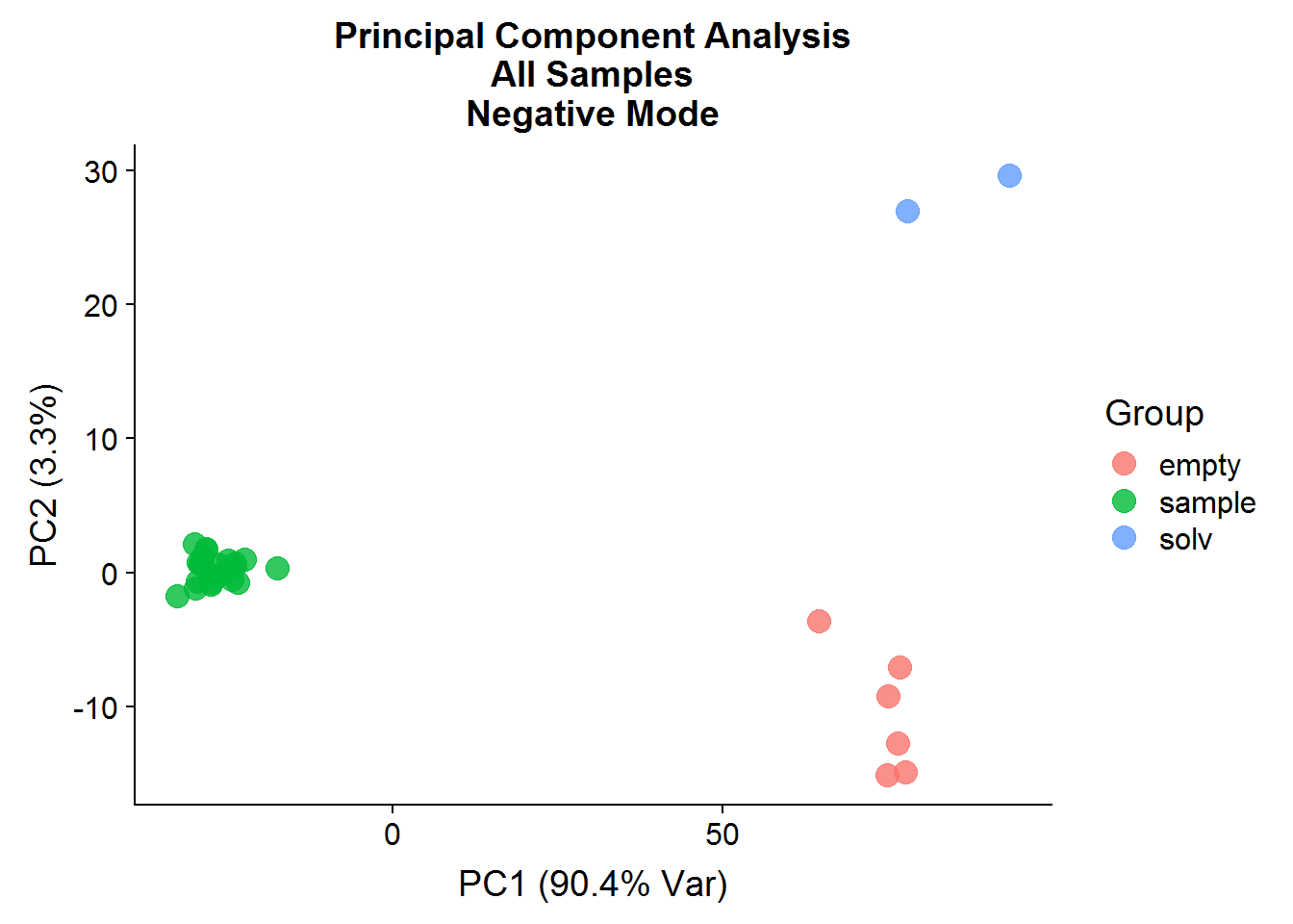
A: No, the first principal component is a good example of how PCA analysis can capture data structure that has nothing to do with experimental interventions. In this case, the negative controls and the experimental samples are separated along the x-axis, which is not surprising because of the difference in signal between the two groups. It goes to show that just because a PC explains a high portion of variance, does not mean that it is meaningful.
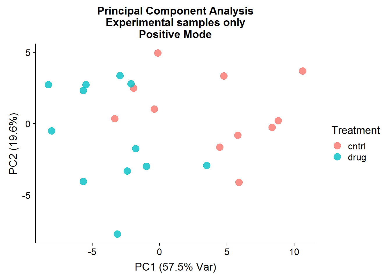
Q: What about a PCA on the experimental samples only, what does the result look like then?
# Experimental Samples Only #
neg.smpl.pca <- neg.noNA %>%
  filter(Group == "sample") %>%
  select(starts_with("ANPnC")) %>%
  mutate_all(scale, center = TRUE, scale = FALSE) %>%
  as.matrix() %>%
  prcomp()
plot(
  (neg.smpl.pca $sdev ^ 2) * 100 / sum(neg.smpl.pca $sdev ^ 2),
  xlab = "Principal Component",
  ylab = "Variance Explained",
  main = "Percent variance explained by each principal component\nExperimental samples only\nNegative Mode",
  type = "b"
  )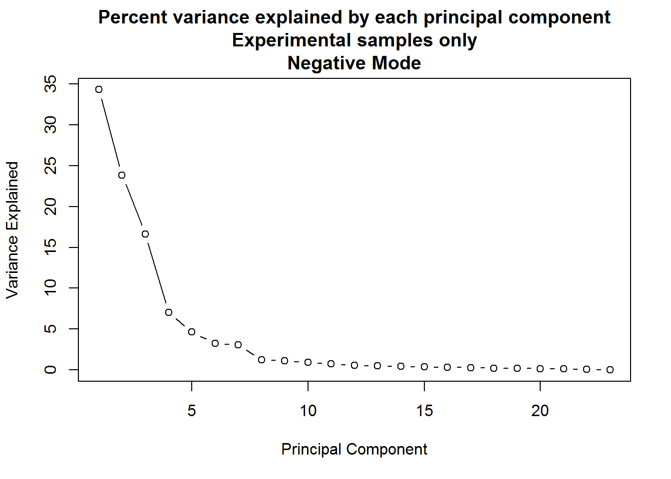
A: When only the experimental samples are considered, the drop-off of variance explained by principal components is far more gradual. In such a situation, anywhere between the first four to seven components might be meaningful.
Here are some plots of the results:
neg.smpl.pca.x <- as.data.frame(neg.smpl.pca$x)
neg.smpl.pca.x <- neg.smpl.pca.x %>%
  bind_cols(
    neg.noNA %>%
      filter(Group == "sample") %>%
      select(Samples, Group:Experiment)
  )
row.names(neg.smpl.pca.x) <- neg.smpl.pca.x$Samples
neg.smpl.pca.x %>%
  ggplot(aes(x = PC1, y = PC2, color = Treatment)) +
  geom_point(size = 4, alpha = 0.8) +
  xlab("PC1 (34.3% Var)") +
  ylab("PC2 (23.8%)") +
  ggtitle("Principal Component Analysis\nExperimental samples only\nNegative Mode")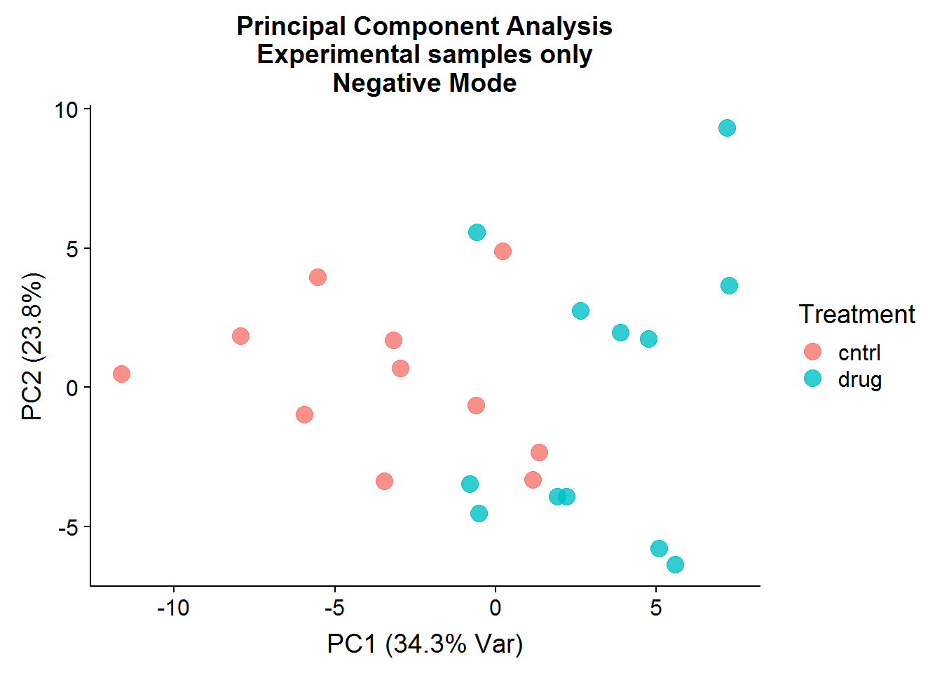
neg.smpl.pca.x %>%
  ggplot(aes(x = PC3, y = PC4, color = Treatment)) +
  geom_point(size = 4, alpha = 0.8) +
  xlab("PC3 (16.6% Var)") +
  ylab("PC4 (7.1%)") +
  ggtitle("Principal Component Analysis\nExperimental samples only\nNegative Mode")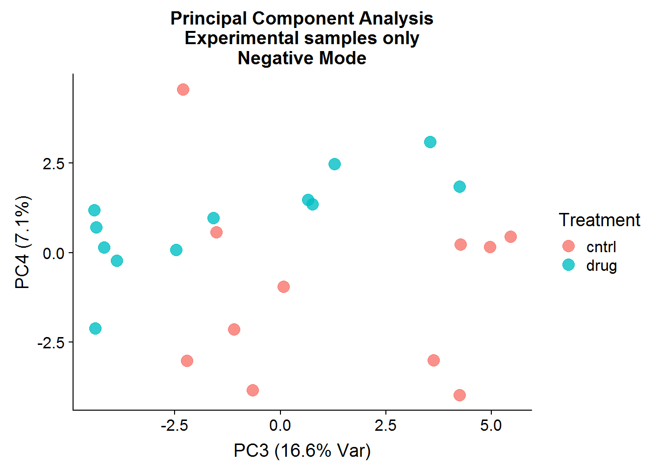
After the negative controls are removed, the resulting principal components are far more informative and suggest that there might be real differences between the control group (that was not treated) and the drug-treated group, even though the separation is not perfect. There is more that can be done with the principal components, such as looking at variable loadings, but because I will be conducting testing for statistical significance later, I will stop at visualization.
Postive Mode
A quick visualization of the principal components for the positive mode data, experimental samples only:
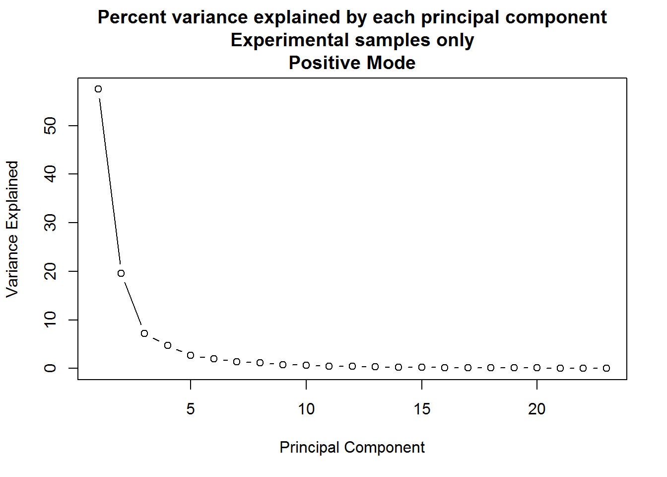
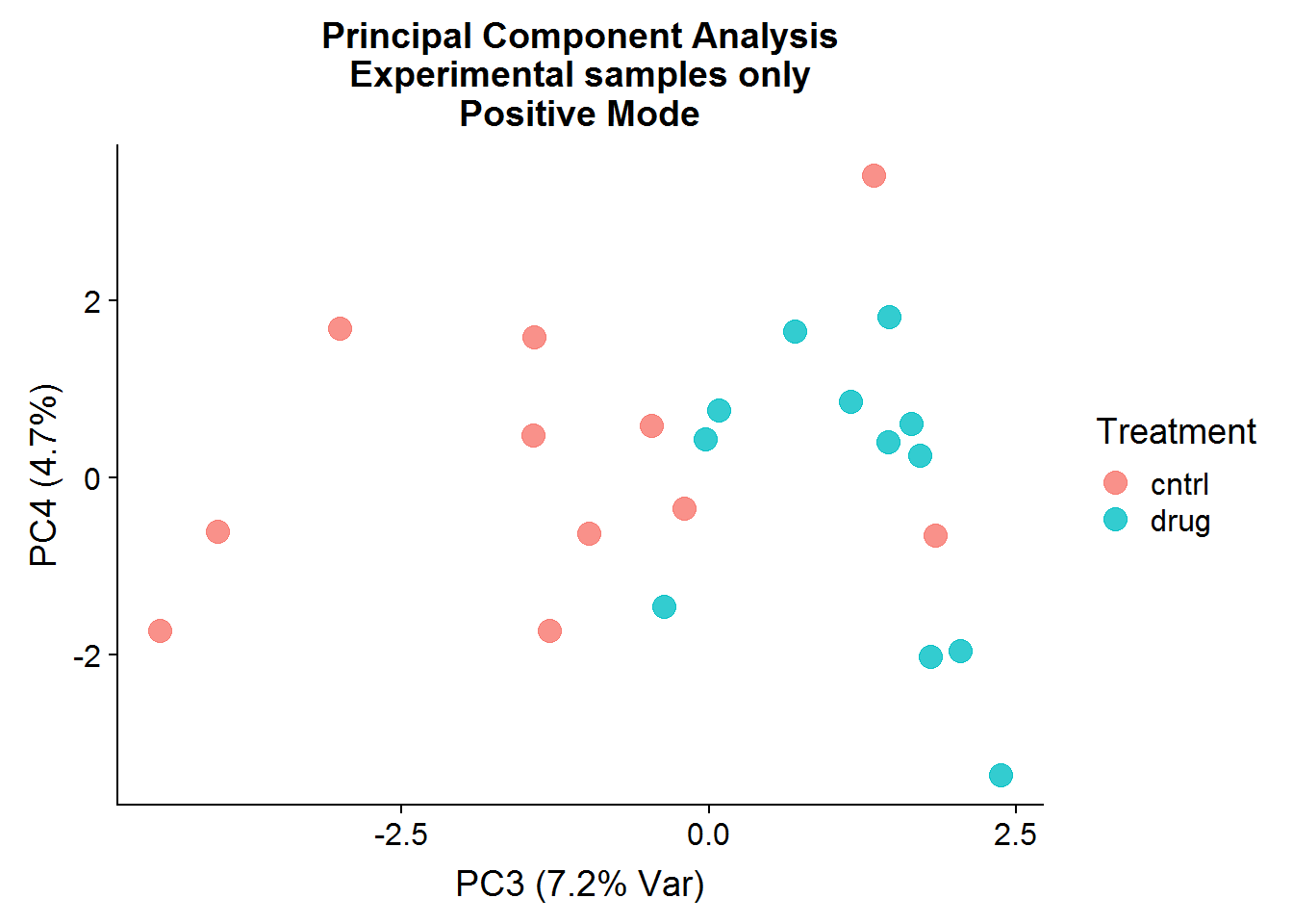
The result of the positive mode dataset PCA analysis is very similar to the negative mode dataset analysis. There can sometimes be instrument issues, for example, that can result in a data structure that appears in one mode, but not the other. This is not the case in this experiment, which means that we can finally stop dawdling around and get to the meaty significance testing.
Batch Effects and Signifiance Testing
Batch effects, or variation due to technical sources such as handling or reagents, are a common problem in scientific research, especially in high-throughput “omics” experiments. They can lead to both false positives, or the illusion of an effect of an intervention when there is none, and to false negatives, or the erroneous conclusion that there is no effect when there really is one. An excellent discussion of batch effects in biological research and potential solutions can be found in this open source article by Jeffrey T. Leek et al. One statistical correction method, that I’ve adopted as well, is surrogate variable analysis (SVA), introduced by Jeffrey T. Leek and John D. Storey in 2007. SVA makes use of the data itself in order to estimate hidden unwanted sources of variation, which can then be used as covariates in statistical analysis or to “clean” the data.
Negative Mode
Surrogate variable analysis
Here, I largely follow the sva tutorial:
# select only the experimental samples
neg.smpl.data <- neg.noNA %>%
    filter(Group == "sample")
# convert to matrix format
neg.data.for.sva <- as.matrix(
  neg.smpl.data[, which(
    colnames(neg.smpl.data) == "ANPnC1"
    ):ncol(neg.smpl.data)]
  )
row.names(neg.data.for.sva) <- neg.smpl.data$Samples
# sva and limma both expect a data format with samples on the columns and features on the rows:
neg.data.for.sva <- t(neg.data.for.sva)
# phenotype prep (accounted for experimental variation)
neg.data.pheno <- as.data.frame(neg.smpl.data[, 5:7])
row.names(neg.data.pheno) <- neg.smpl.data$Samples
# full model matrix, that includes the intercept and the treatment variable:
neg.mod.drug <- model.matrix(~ as.factor(Treatment), data = neg.data.pheno)
head(neg.mod.drug)
(Intercept) as.factor(Treatment)drug
T1_P1_C1 1 0
T1_P1_C2 1 0
T1_P1_C3 1 0
T1_P1_D1 1 1
T1_P1_D2 1 1
T1_P1_D3 1 1# null model, which only includes the intercept
neg.mod0 <- model.matrix(~ 1, data = neg.data.pheno)
head(neg.mod0) (Intercept)
T1_P1_C1 1
T1_P1_C2 1
T1_P1_C3 1
T1_P1_D1 1
T1_P1_D2 1
T1_P1_D3 1# surrogate variable estimation
neg.sv <- sva(neg.data.for.sva, neg.mod.drug, neg.mod0)Number of significant surrogate variables is: 3
Iteration (out of 5 ):1 2 3 4 5 # structure of the result:
glimpse(neg.sv)List of 4
$ sv : num [1:23, 1:3] -0.0257 0.2269 0.2468 0.263 -0.0802 ...
$ pprob.gam: num [1:179] 0.93 0.999 0.727 1 0.842 ...
$ pprob.b : num [1:179] 0.9837 0.9999 0.2624 0.0457 0.9761 ...
$ n.sv : num 3The sva function accepts the transposed data (in matrix format), and two model matrices: the null model and the full model, which should include any variables of interest. The intercept term is 1 for all samples to capture the base or control level of metabolite abundance. The second column in the full model is the Treatment term, which is 0 for control samples and 1 for the drug-treated samples. This second term is there to capture any change in metabolite abundance after drug treatment, as compared to the control level. SVA then attempts to extract any hidden data structure not accounted for by the provided variables.
Significance Testing
The above section might sound suspiciously like linear regression, even if you’re not familiar with this type of analysis. And indeed it is! Your typical academic lives and dies by their t-tests and p-values, but in fact, t-tests (and many other statistical tests), are a special case of linear regression on a categorical variable in one form or another. Which means that covariates can be readily incorporated and accounted for without too much trouble.
I mentioned earlier that surrogate variables could also be used to “clean” data by regressing the features of interest onto the variables, taking the residuals, and then going on with other analysis (or use ComBat to directly adjust the data). However, the sva user manual and other sources recommend that the covariate approach as is the correct method to go to keep the degrees of freedom straight in the statistical analysis. Cleaning data should be perfectly okay for data visualization further on.
# extract the surrogate variables
neg.surr.var <- as.data.frame(neg.sv$sv)
colnames(neg.surr.var) <- c("S1", "S2", "S3")
colnames(neg.mod.drug) <- c("cntrl", "DRUGvsCNTRL")
# combine the full model matrix and the surrogate variables into one
neg.d.sv <- cbind(neg.mod.drug, neg.surr.var)
head(neg.d.sv)
cntrl DRUGvsCNTRL S1 S2 S3
T1_P1_C1 1 0 -0.02572670 0.30588286 -0.24101509
T1_P1_C2 1 0 0.22693416 -0.04248658 -0.16668619
T1_P1_C3 1 0 0.24683594 0.01195802 -0.16215771
T1_P1_D1 1 1 0.26304093 0.05597521 0.10204063
T1_P1_D2 1 1 -0.08024336 0.19758531 0.01981105
T1_P1_D3 1 1 -0.08965598 0.26184963 -0.00716443neg.top.table <- neg.data.for.sva %>%
# fit a linear model
lmFit(neg.d.sv) %>%
# calculate the test statistics
eBayes() %>%
# select the top features that have a p-value < 0.05 after Bonferroni multiple hypothesis correction
topTable(coef = "DRUGvsCNTRL", adjust = "bonferroni", p.value = 0.05, n = nrow(neg.data.for.sva))
# what the result looks like:
head(neg.top.table) logFC AveExpr t P.Value adj.P.Val
ANPnC119 -1.1323186 16.34932 -16.409667 3.271285e-13 5.855600e-11
ANPnC152 -1.3534317 16.93098 -11.248220 3.410586e-10 6.104950e-08
ANPnC114 0.9294965 15.08073 10.511594 1.116320e-09 1.998213e-07
ANPnC148 -0.7049114 14.87538 -8.903691 1.840005e-08 3.293608e-06
ANPnC18 -0.6384362 21.20349 -8.657914 2.903710e-08 5.197640e-06
ANPnC97 -0.3901582 19.32692 -8.136154 7.849318e-08 1.405028e-05
B
ANPnC119 20.447355
ANPnC152 13.521747
ANPnC114 12.324752
ANPnC148 9.486352
ANPnC18 9.023421
ANPnC97 8.013953# let's make it more meaningful
neg.top.w.info <- neg.top.table %>%
rownames_to_column("compound_short") %>%
mutate(
# limma's logFC is base 2, so to get the raw FC out:
drug_div_cntrl = round(2 ^ logFC, 2),
# for ease of interpretation:
change_w_drug = ifelse(drug_div_cntrl < 1, "down", "up")
) %>%
# cut-off for "biologically meaningful" change - arbitrary
filter(drug_div_cntrl > 1.2 | drug_div_cntrl < 1 / 1.2) %>%
arrange(change_w_drug, desc(drug_div_cntrl))
# full list of hits:
neg.top.w.info %>%
select(compound_short, change_w_drug, drug_div_cntrl) compound_short change_w_drug drug_div_cntrl
1 ANPnC33 down 0.81
2 ANPnC58 down 0.80
3 ANPnC65 down 0.78
4 ANPnC97 down 0.76
5 ANPnC41 down 0.74
6 ANPnC23 down 0.72
7 ANPnC46 down 0.71
8 ANPnC135 down 0.67
9 ANPnC18 down 0.64
10 ANPnC86 down 0.64
11 ANPnC148 down 0.61
12 ANPnC136 down 0.61
13 ANPnC172 down 0.51
14 ANPnC119 down 0.46
15 ANPnC144 down 0.46
16 ANPnC10 down 0.45
17 ANPnC48 down 0.43
18 ANPnC176 down 0.42
19 ANPnC127 down 0.41
20 ANPnC152 down 0.39
21 ANPnC159 down 0.38
22 ANPnC160 down 0.32
23 ANPnC138 down 0.29
24 ANPnC168 down 0.15
25 ANPnC169 down 0.12
26 ANPnC114 up 1.90
27 ANPnC54 up 1.81
28 ANPnC53 up 1.59
29 ANPnC200 up 1.57
30 ANPnC157 up 1.53
31 ANPnC189 up 1.49
32 ANPnC67 up 1.48
33 ANPnC44 up 1.45
34 ANPnC73 up 1.42
35 ANPnC124 up 1.41
36 ANPnC17 up 1.27
37 ANPnC30 up 1.24
38 ANPnC2 up 1.23The final result is that 38 compounds were found to be statistically significant with a p-value < 0.05 after multiple hypothesis testing correction, with a fold change cut-off of about 20% between the control and drug-treated groups. Out of those, 13 of the compounds were higher in the drug-treated group and 25 were lower in abundance.
Fold changes are nice, but nothing beats some data visualization, so let’s clean the data of the surrogate variables the tidyverse way, with nested models. The following approach could have also been used for statistical testing, but limma provides a few advantages, such as variance pooling across features and speed through matrix operations. The latter isn’t necessarily a problem in this case because I’m working with a relatively small number of features, but it’s a big advantage for analyses that might include tens of thousands of compounds or genes.
neg.gathered <- neg.noNA %>%
  filter(Group == "sample") %>%
  bind_cols(neg.surr.var) %>%
  select(Samples, Treatment, S1:S3, starts_with("ANPnC")) %>%
  gather(key = "Compound", value = "Abundance", ANPnC1:ANPnC99)
# structure so far:
glimpse(neg.gathered)
Observations: 4,117
Variables: 7
$ Samples <chr> "T1_P1_C1", "T1_P1_C2", "T1_P1_C3", "T1_P1_D1", "T1_...
$ Treatment <chr> "cntrl", "cntrl", "cntrl", "drug", "drug", "drug", "...
$ S1 <dbl> -0.02572670, 0.22693416, 0.24683594, 0.26304093, -0....
$ S2 <dbl> 0.30588286, -0.04248658, 0.01195802, 0.05597521, 0.1...
$ S3 <dbl> -0.2410150862, -0.1666861888, -0.1621577120, 0.10204...
$ Compound <chr> "ANPnC1", "ANPnC1", "ANPnC1", "ANPnC1", "ANPnC1", "A...
$ Abundance <dbl> 15.08795, 14.67335, 14.81717, 14.55139, 14.79476, 15...neg.nested <- neg.gathered %>%
group_by(Compound) %>%
nest() %>%
# apply a linear model to each individual compound, as a function of the surrogate variables
mutate(model = map(data, ~lm(Abundance ~ S1 + S2 + S3, data = .))) %>%
# use broom to tidy up the output
mutate(augment_model = map(model, augment))
# result to far:
neg.nested# A tibble: 179 x 4
Compound data model augment_model
<chr> <list> <list> <list>
1 ANPnC1 <tibble [23 x 6]> <S3: lm> <tibble [23 x 11]>
2 ANPnC10 <tibble [23 x 6]> <S3: lm> <tibble [23 x 11]>
3 ANPnC100 <tibble [23 x 6]> <S3: lm> <tibble [23 x 11]>
4 ANPnC101 <tibble [23 x 6]> <S3: lm> <tibble [23 x 11]>
5 ANPnC102 <tibble [23 x 6]> <S3: lm> <tibble [23 x 11]>
6 ANPnC103 <tibble [23 x 6]> <S3: lm> <tibble [23 x 11]>
7 ANPnC104 <tibble [23 x 6]> <S3: lm> <tibble [23 x 11]>
8 ANPnC105 <tibble [23 x 6]> <S3: lm> <tibble [23 x 11]>
9 ANPnC106 <tibble [23 x 6]> <S3: lm> <tibble [23 x 11]>
10 ANPnC107 <tibble [23 x 6]> <S3: lm> <tibble [23 x 11]>
# ... with 169 more rows# now to get the residuals out for each compound
neg.modSV.resid <- neg.nested %>%
unnest(data, augment_model) %>%
select(Samples, Treatment, Compound, .resid) %>%
# return to long format
spread(Compound, .resid)
glimpse(neg.modSV.resid[, 1:5])Observations: 23
Variables: 5
$ Samples <chr> "T1_P1_C1", "T1_P1_C2", "T1_P1_C3", "T1_P1_D1", "T1_...
$ Treatment <chr> "cntrl", "cntrl", "cntrl", "drug", "drug", "drug", "...
$ ANPnC1 <dbl> 0.10319936, -0.06371124, 0.04982032, -0.24595544, -0...
$ ANPnC10 <dbl> 0.29867785, 0.67292980, 0.19366552, -1.03548312, -0....
$ ANPnC100 <dbl> 0.098012517, -0.085761072, 0.123939301, 0.084645145,...# heatmap of the result:
neg.modSV.resid %>%
select(Samples, one_of(neg.top.w.info$compound_short)) %>%
# converts data to matrix, centers and scales it within each column
HeatmapPrepAlt("ANPnC") %>%
t() %>%
heatmaply(
colors = viridis(n = 10, option = "magma"),
xlab = "Samples", ylab = "Compounds",
main = "Statistically significant compounds\nNegative Mode",
margins = c(50, 50, 75, 30),
k_col = 2, k_row = 2
)Clustering heatmaps are a popular visualization tool in bioinformatics. Clustering on high-dimensional data can be problematic because of the curse of dimensionality, but it is handy for showing all of the data when possible. Here, there are clearly 2 main clusters of samples, with the drug-treated sample branches colored in pink and the control sample branches in blue at the top. There are two major clusters of compounds as well, with the branches on the rows colored in blue for the compounds that are decreased in abundance in the drug-treated samples, and increased in abundance for the pink-colored compounds.
Positive Mode
The process the same for the positive mode dataset, so I will again only include the results here:
Number of significant surrogate variables is:  2
Iteration (out of 5 ):1  2  3  4  5
compound_short change_w_drug drug_div_cntrl
1 ANPpC35 down 0.80
2 ANPpC40 down 0.76
3 ANPpC51 down 0.73
4 ANPpC101 down 0.64
5 ANPpC24 down 0.64
6 ANPpC49 down 0.63
7 ANPpC67 down 0.61
8 ANPpC89 down 0.61
9 ANPpC112 down 0.55
10 ANPpC38 down 0.46
11 ANPpC39 down 0.45
12 ANPpC119 down 0.45
13 ANPpC14 down 0.44
14 ANPpC134 down 0.44
15 ANPpC107 down 0.43
16 ANPpC85 down 0.42
17 ANPpC60 down 0.41
18 ANPpC95 down 0.40
19 ANPpC74 down 0.38
20 ANPpC120 down 0.38
21 ANPpC121 down 0.35
22 ANPpC100 down 0.15
23 ANPpC17 up 1.89
24 ANPpC37 up 1.58
25 ANPpC52 up 1.53
26 ANPpC172 up 1.49
27 ANPpC159 up 1.42
28 ANPpC41 up 1.35
29 ANPpC56 up 1.32
30 ANPpC90 up 1.29
31 ANPpC105 up 1.25
32 ANPpC171 up 1.21The positive mode dataset results echo and compliment the negative mode results. From here, the compound identities can be used to try and explain what is actually going on. This step usually involves a lot of research and background reading, but there are tools such as MetaboAnalyst that are really popular for figuring out which metabolic pathways were impacted.
Interpretation
Please excuse the secrecy, but this data is unpublished (although hopefully not for long?) But I have selected a portion of the statistically significant compounds for interpretation from the 3 following metabolic pathways:
- Pentose Phosphate Pathway (PPP) - typically anabolic pathway that uses sugars and glycolysis intermediates to synthesize the ribose backbone for nucleotide biosynthesis and to produce the reducing molecule NADPH
- Purine Metabolism - the biosynthesis and breakdown of the nucleotides ATP/dATP and GTP/dGTP, the building blocks of DNA and RNA, as well as molecules that play vital roles in energy homeostasis and signaling
- Pyrimidine Metabolism - the biosynthesis and breakdown of the nucleotides dTTP, UTP, and CTP/dCTP, also the building blocks of DNA and RNA
One of the interesting things I noted was that the drug had a profound effect on decreasing the abundance of a number of molecules involved in these pathways.
# Hits file
pathway.info <- read_csv("./data/pathway_info.csv")
# give a name to some of the hits:
glimpse(pathway.info)
Observations: 35
Variables: 4
$ compound_full <chr> "D-Glucose 6-phosphate", "D-Ribose", "Deoxyribo...
$ compound_short <chr> "ANPnC136", "ANPpC49", "ANPnC46", "ANPnC86", "A...
$ Name <chr> "Glucose 6-phosphate", "Ribose", "Deoxyribose",...
$ Pathway <chr> "PPP", "PPP", "PPP", "PPP", "PPP", "PPP", "PPP"...# pathway numbers:
table(pathway.info$Pathway)
       PPP     Purine Pyrimidine
         7         17         11
hit.list <- neg.top.w.info %>%
mutate(Mode = "neg") %>%
bind_rows(
pos.top.w.info %>%
mutate(Mode = "pos")
) %>%
as.tibble() %>%
select(compound_short, drug_div_cntrl:Mode) %>%
inner_join(
pathway.info, by = "compound_short"
)
glimpse(hit.list)Observations: 35
Variables: 7
$ compound_short <chr> "ANPnC65", "ANPnC46", "ANPnC86", "ANPnC148", "A...
$ drug_div_cntrl <dbl> 0.78, 0.71, 0.64, 0.61, 0.61, 0.51, 0.46, 0.43,...
$ change_w_drug <chr> "down", "down", "down", "down", "down", "down",...
$ Mode <chr> "neg", "neg", "neg", "neg", "neg", "neg", "neg"...
$ compound_full <chr> "Xanthine", "Deoxyribose", "G3P", "Sedoheptulos...
$ Name <chr> "Xanthine (Neg)", "Deoxyribose", "Glyceraldehyd...
$ Pathway <chr> "Purine", "PPP", "PPP", "PPP", "PPP", "Purine",...Nucleotide Metabolism
The following section groups the statistically significant hits by pathway (although there is some overlap of members between pathways), and is mostly a lot of formatting for publication-quality plots. I chose boxplots to show the distribution of the data but also overlaid them with the individual data points to make all of the data visible.
### Purine Metabolism ###
purine.plot.order <- pathway.info %>%
  filter(Pathway == "Purine") %>%
  mutate(plot_order = factor(Name, levels = Name))
purine.data <- neg.modSV.resid %>%
  inner_join(pos.modSV.resid %>% select(-Treatment), by = "Samples") %>%
  select(Samples:Treatment, one_of(purine.plot.order$compound_short))
purine.data %>%
  gather(key = "compound_short", value = "Abundance", -Samples, -Treatment) %>%
  inner_join(
    purine.plot.order %>%
      filter(compound_full != "Aspartic Acid" & compound_full != "Ribose 5-Phosphate"),
    by = "compound_short"
    ) %>%
  ggplot(aes(plot_order, Abundance, color = Treatment)) +
  geom_boxplot(position = position_dodge(0.8)) +
  geom_jitter(size = 2, alpha = 0.5, position = position_dodge(0.8)) +
  theme(
    axis.text.x = element_text(angle = 45, hjust = 1, vjust = 1),
    panel.background = element_rect(fill = "gray90")
    ) +
  xlab("Compound (Mode)") +
  ylab("Residual Abundance") +
 ggtitle("Residual Abundance by Treatment\nPurine Metabolism\nStatistically Significant Compounds") +
  scale_color_manual(values = c("#56B4E9", "#E69F00"), labels = c("Control", "Drug")) +
  ylim(-4, 4)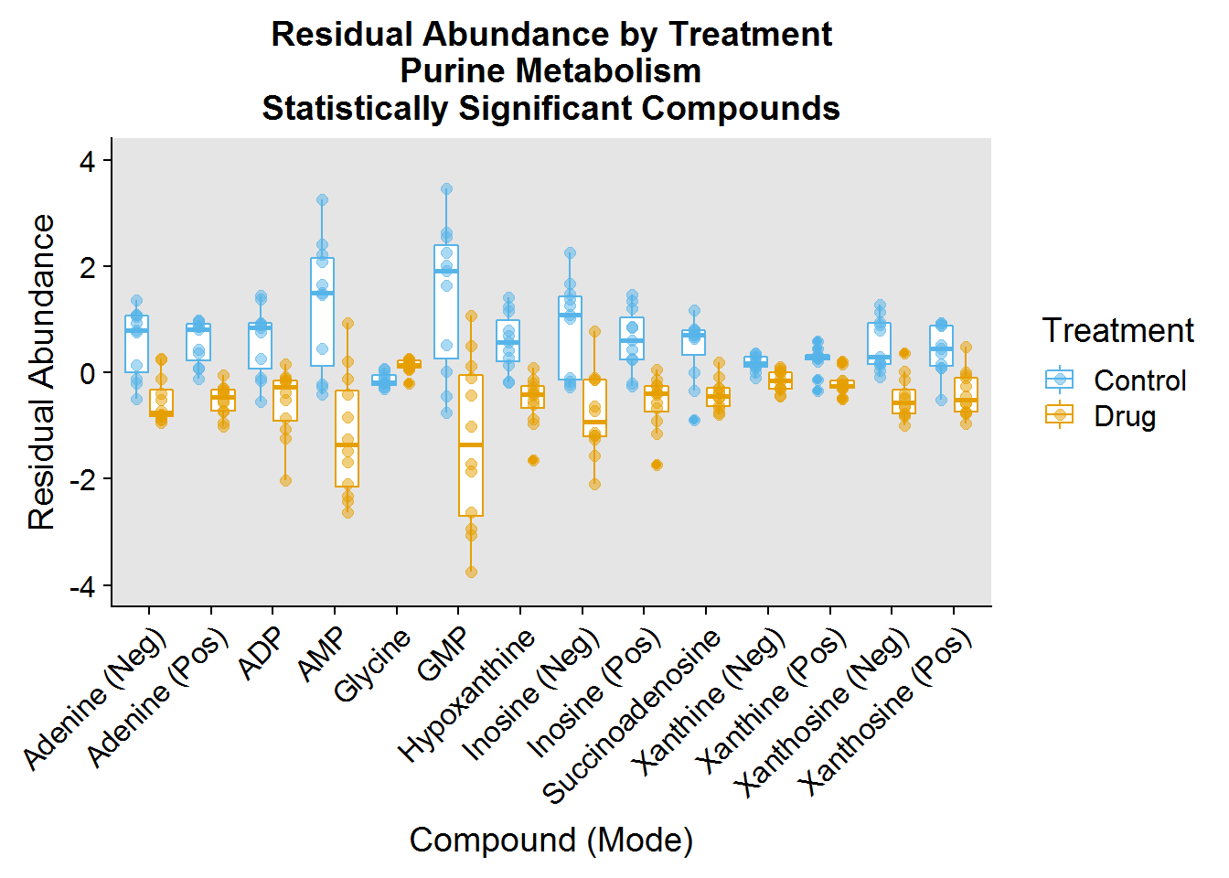
### Pyrimidine Metabolism ###
pyrimidine.plot.order <- pathway.info %>%
  filter(Pathway == "Pyrimidine") %>%
  mutate(plot_order = factor(Name, levels = Name))
pyrimidine.data <- neg.modSV.resid %>%
  inner_join(pos.modSV.resid %>% select(-Treatment), by = "Samples") %>%
  select(Samples:Treatment, one_of(pyrimidine.plot.order$compound_short))
pyrimidine.data %>%
  gather(key = "compound_short", value = "Abundance", -Samples, -Treatment) %>%
  inner_join(
    pyrimidine.plot.order %>%
      filter(compound_full != "Ribose 5-Phosphate"), by = "compound_short") %>%
  ggplot(aes(plot_order, Abundance, color = Treatment)) +
  geom_boxplot(position = position_dodge(0.8)) +
  geom_jitter(size = 2, alpha = 0.5, position = position_dodge(0.8)) +
  theme(
    axis.text.x = element_text(angle = 45, hjust = 1, vjust = 1),
    panel.background = element_rect(fill = "gray90")
    ) +
  xlab("Compound (Mode)") +
  ylab("Residual Abundance") +
  ggtitle("Residual Abundance by Treatment\nPyrimidine Metabolism\nStatistically Significant Compounds") +
  scale_color_manual(values = c("#56B4E9", "#E69F00"), labels = c("Control", "Drug")) +
  ylim(-2, 2)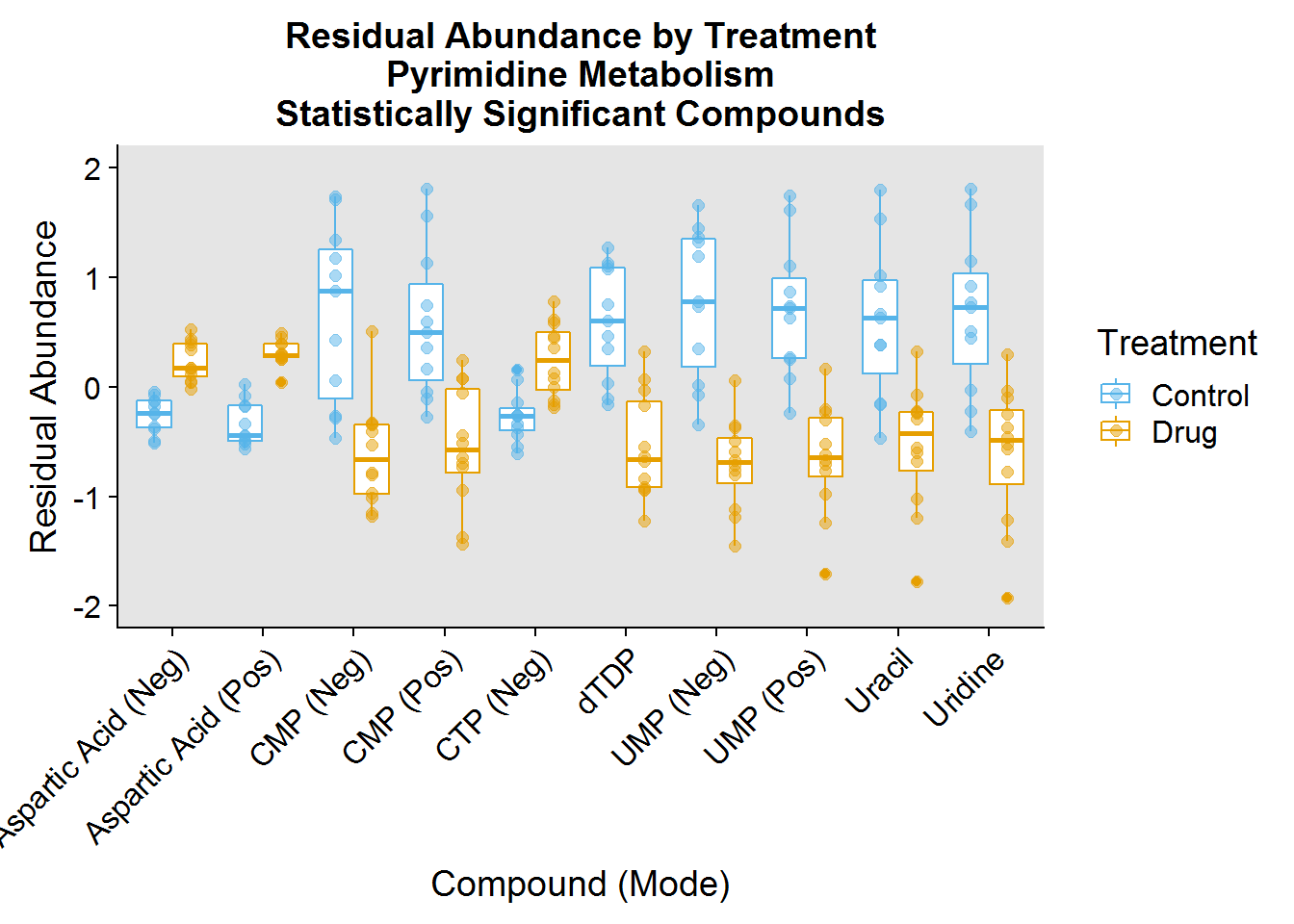
### Pentose Phosphate Pathway ###
ppp.plot.order <- pathway.info %>%
  filter(Pathway == "PPP") %>%
  mutate(plot_order = factor(Name, levels = Name))
ppp.data <- neg.modSV.resid %>%
  inner_join(pos.modSV.resid %>% select(-Treatment), by = "Samples") %>%
  select(Samples:Treatment, one_of(ppp.plot.order $compound_short))
ppp.data %>%
  gather(key = "compound_short", value = "Abundance", -Samples, -Treatment) %>%
  inner_join(ppp.plot.order, by = "compound_short") %>%
  ggplot(aes(plot_order, Abundance, color = Treatment)) +
  geom_boxplot(position = position_dodge(0.8)) +
  geom_jitter(size = 2, alpha = 0.5, position = position_dodge(0.8)) +
  theme(
    axis.text.x = element_text(angle = 45, hjust = 1, vjust = 1),
    panel.background = element_rect(fill = "gray90")
    ) +
  xlab("Compound (Mode)") +
  ylab("Residual Abundance") +
  ggtitle("Residual Abundance by Treatment Group\nPPP Metabolism\nStatistically Significant Compounds") +
  scale_color_manual(values = c("#56B4E9", "#E69F00"), labels = c("Control", "Drug")) +
  ylim(-1.5, 1.5) +
  scale_x_discrete(labels = c("Glucose\n6-Phosphate", "Ribose", "Deoxyribose", "Glyceraldehyde\n3-Phosphate (Neg)", "Glyceraldehyde\n3-Phosphate (Pos)", "Ribose\n5-Phosphate", "Sedoheptulose\n7-Phosphate"))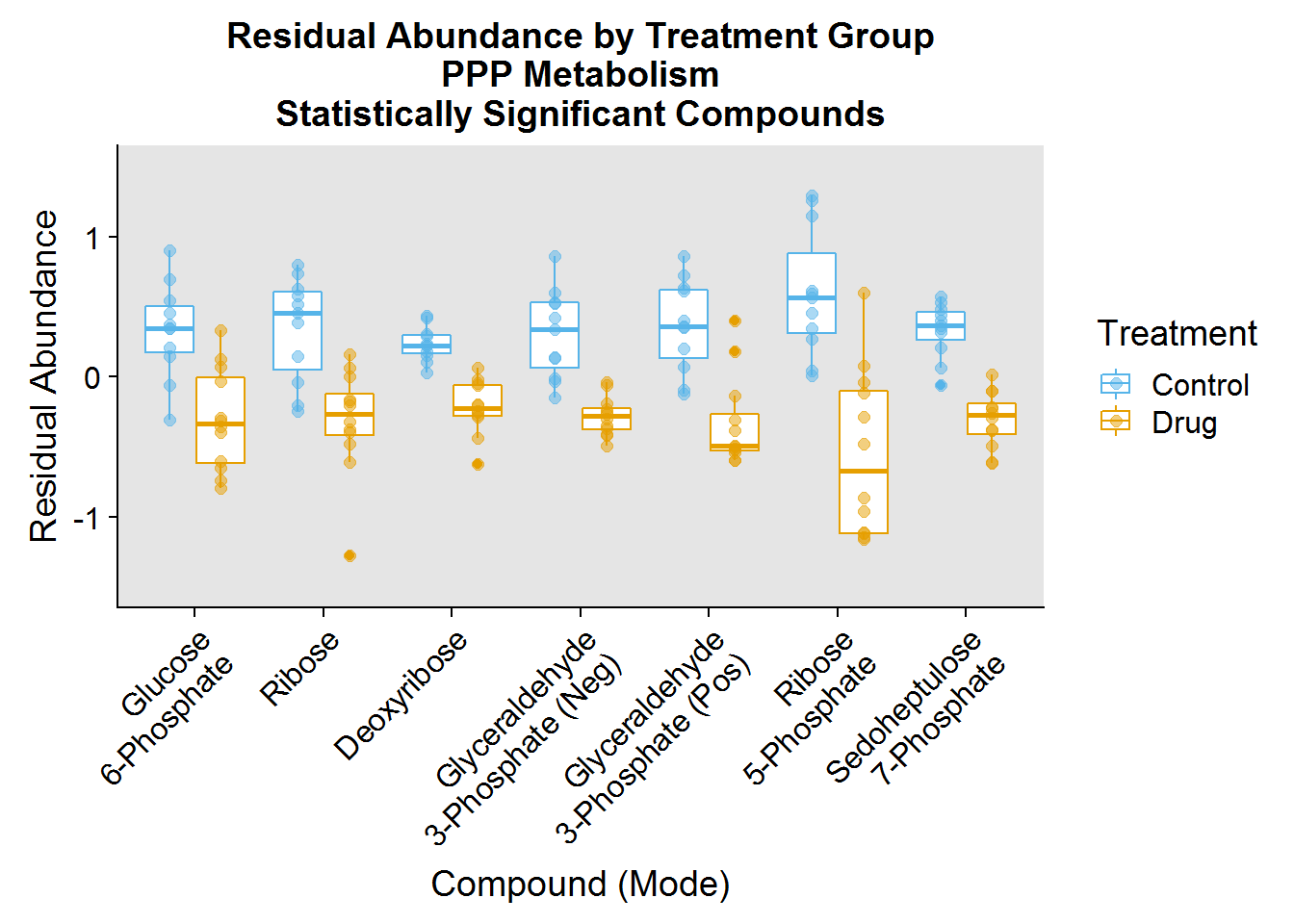
And that’s that. Thanks for reading!
Session Info
Lastly, session info:
sessionInfo()R version 3.5.1 (2018-07-02)
Platform: x86_64-w64-mingw32/x64 (64-bit)
Running under: Windows 7 x64 (build 7601) Service Pack 1
Matrix products: default
locale:
[1] LC_COLLATE=English_United States.1252
[2] LC_CTYPE=English_United States.1252
[3] LC_MONETARY=English_United States.1252
[4] LC_NUMERIC=C
[5] LC_TIME=English_United States.1252
attached base packages:
[1] stats graphics grDevices utils datasets methods base
other attached packages:
[1] bindrcpp_0.2.2 ggridges_0.5.1 broom_0.5.0
[4] limma_3.36.2 sva_3.28.0 BiocParallel_1.14.2
[7] genefilter_1.62.0 mgcv_1.8-24 nlme_3.1-137
[10] heatmaply_0.15.2 viridis_0.5.1 viridisLite_0.3.0
[13] plotly_4.8.0 cowplot_0.9.3 forcats_0.3.0
[16] stringr_1.3.1 dplyr_0.7.6 purrr_0.2.5
[19] readr_1.1.1 tidyr_0.8.1 tibble_1.4.2
[22] ggplot2_3.0.0 tidyverse_1.2.1
loaded via a namespace (and not attached):
[1] colorspace_1.3-2 class_7.3-14 modeltools_0.2-22
[4] mclust_5.4.1 rprojroot_1.3-2 rstudioapi_0.8
[7] bit64_0.9-7 flexmix_2.3-14 fansi_0.4.0
[10] AnnotationDbi_1.42.1 mvtnorm_1.0-8 lubridate_1.7.4
[13] xml2_1.2.0 splines_3.5.1 codetools_0.2-15
[16] robustbase_0.93-3 knitr_1.20 jsonlite_1.5
[19] annotate_1.58.0 cluster_2.0.7-1 kernlab_0.9-27
[22] shiny_1.1.0 compiler_3.5.1 httr_1.3.1
[25] backports_1.1.2 assertthat_0.2.0 Matrix_1.2-14
[28] lazyeval_0.2.1 cli_1.0.1 later_0.7.5
[31] htmltools_0.3.6 tools_3.5.1 gtable_0.2.0
[34] glue_1.3.0 reshape2_1.4.3 Rcpp_0.12.19
[37] Biobase_2.40.0 cellranger_1.1.0 trimcluster_0.1-2.1
[40] gdata_2.18.0 blogdown_0.8 crosstalk_1.0.0
[43] iterators_1.0.10 fpc_2.1-11.1 xfun_0.3
[46] rvest_0.3.2 mime_0.6 gtools_3.8.1
[49] XML_3.98-1.16 dendextend_1.8.0 DEoptimR_1.0-8
[52] MASS_7.3-50 scales_1.0.0 TSP_1.1-6
[55] promises_1.0.1 hms_0.4.2 parallel_3.5.1
[58] RColorBrewer_1.1-2 yaml_2.2.0 memoise_1.1.0
[61] gridExtra_2.3 stringi_1.2.4 RSQLite_2.1.1
[64] gclus_1.3.1 S4Vectors_0.18.3 foreach_1.4.4
[67] seriation_1.2-3 caTools_1.17.1.1 BiocGenerics_0.26.0
[70] matrixStats_0.54.0 rlang_0.2.2 pkgconfig_2.0.2
[73] prabclus_2.2-6 bitops_1.0-6 evaluate_0.12
[76] lattice_0.20-35 bindr_0.1.1 labeling_0.3
[79] htmlwidgets_1.3 bit_1.1-14 tidyselect_0.2.5
[82] plyr_1.8.4 magrittr_1.5 bookdown_0.7
[85] R6_2.3.0 IRanges_2.14.10 gplots_3.0.1
[88] DBI_1.0.0 pillar_1.3.0 haven_1.1.2
[91] whisker_0.3-2 withr_2.1.2 survival_2.42-6
[94] RCurl_1.95-4.11 nnet_7.3-12 modelr_0.1.2
[97] crayon_1.3.4 utf8_1.1.4 KernSmooth_2.23-15
[100] rmarkdown_1.10 grid_3.5.1 readxl_1.1.0
[103] data.table_1.11.8 blob_1.1.1 digest_0.6.18
[106] diptest_0.75-7 webshot_0.5.1 xtable_1.8-3
[109] httpuv_1.4.5 stats4_3.5.1 munsell_0.5.0
[112] registry_0.5